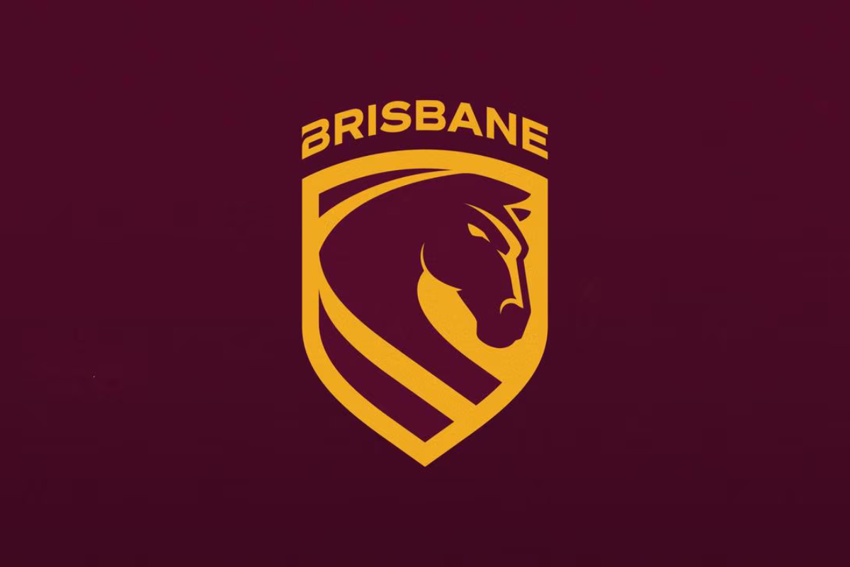
The New Broncos logo meaning forms the centrepiece of Brisbane’s most significant identity refresh in decades. With the club entering 2026 as a reigning dual-premiership heavyweight and the city preparing for the 2032 Olympics, the Broncos set out to modernise how they present themselves across uniforms, broadcast graphics and international-facing branding.
The redesign was not a sudden shift — it followed months of internal planning, fan-focused workshops and commercial discussions. The spark, however, came earlier than intended when an IP filing leaked online, showing glimpses of the shield and front-facing horse long before launch.
This explainer breaks down how the new elements work together and what each part of the identity is meant to represent.
How the Rebrand Works & New Broncos Logo Meaning — Reference Table
When the leaked trademark image appeared, many fans questioned its authenticity because the design felt drastically different from the long-standing side-profile horse. But the emblem was indeed real, forming the basis of an 18-month brand project developed with global creative agency DDB Group.
The goal: create a flexible brand system that works on digital platforms, merchandise, stadium signage and global broadcasts — a requirement for modern sports clubs.
New Broncos Logo Meaning — Reference Table
| Element | Explanation |
|---|---|
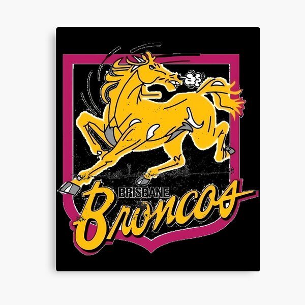
| Forward-facing horse | Symbolises momentum, aggression and modernity — replacing the long-standing side profile. |
| Shield shape | References the club’s 1988 foundation and early visual identity. |
| Central line | Represents the Brisbane River cutting through the heart of the city. |
| “Brisbane” wordmark | First time the club prioritises city identity over the “Broncos” name. |
| Minimalist styling | Follows global sport trends toward simple, scalable, modern marks. |
This structure allows the Broncos to use the logo across multiple formats without distortion — something older, more detailed crests struggled to achieve.
New Broncos Logo Meaning in Context: Jerseys, Wordmarks & the New Mantra
The New Broncos logo meaning becomes clearer once applied across the full 2026 kit set and brand messaging. The updated horse sits inside a shield designed to remain legible during quick broadcast transitions or on fast-moving players — an issue clubs like the Warriors and Tigers previously addressed in their redesigns.
Why the Word “Broncos” No Longer Leads the Branding
The switch to a “Brisbane-first” wordmark reflects three priorities:
- Stronger alignment with Olympic-era city branding
- A sharper international footprint for NRL markets abroad
- A strategic claim to southeast Queensland identity amid Dolphins expansion
Some fans welcomed this as an evolution; others argued the Broncos name was essential to the club’s DNA.
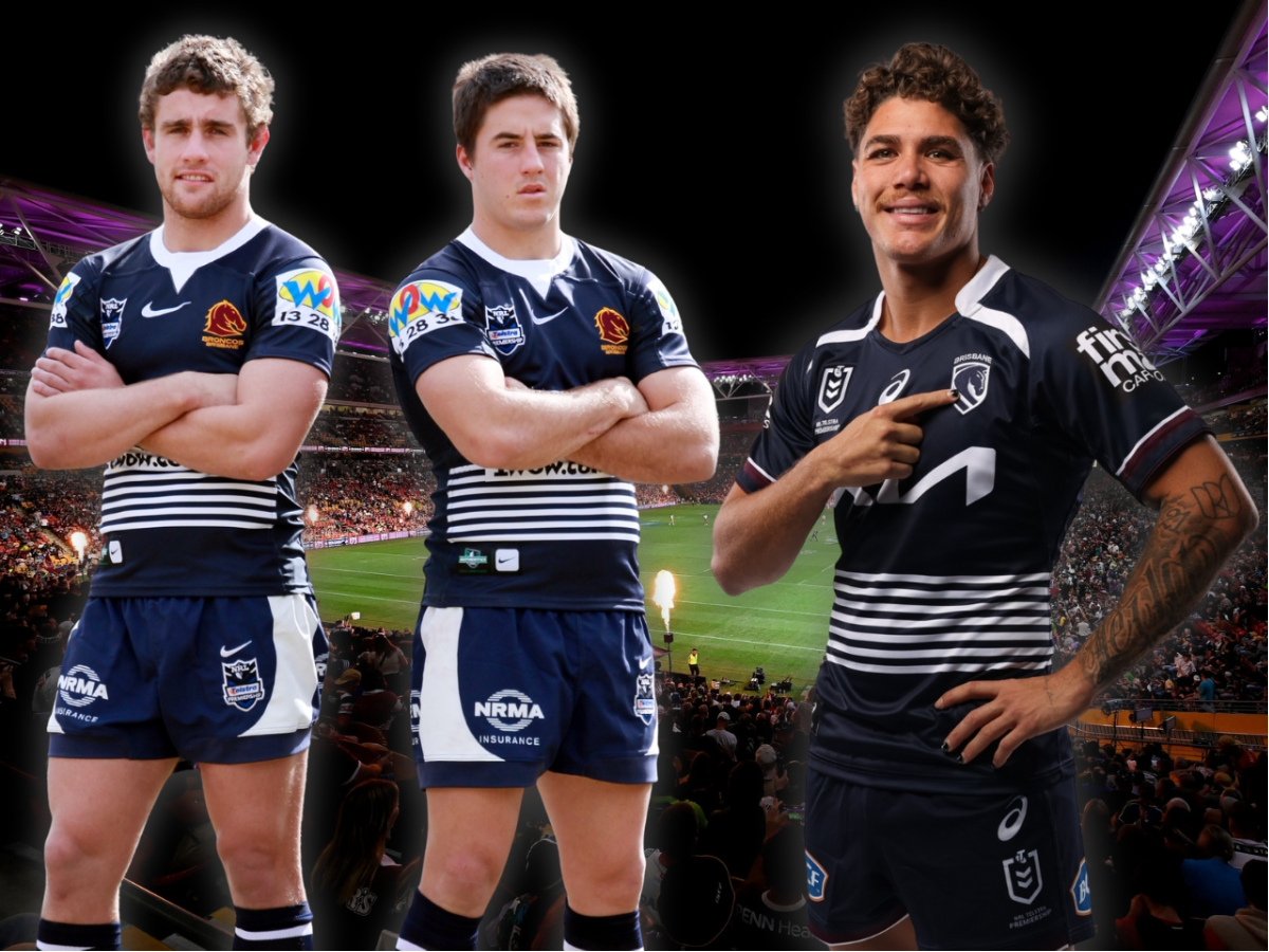
How the 2026 Jerseys Fit the System
Each jersey was designed to complement the simplified emblem:
- Home jersey: streamlined maroon-gold layout, with the shield positioned higher for better TV visibility
- Away jersey: midnight/navy Cyril Connell tribute, honouring the Queensland talent icon
- Heritage touchpoints: stitching and trims inspired by early-era Broncos and state rugby league culture
The mantra “We Charge On” ties everything together — appearing subtly on jersey tags, social rollouts and internal team messaging.
How Fans and Media Are Interpreting the 2026 Brand System – New Broncos logo meaning
Reactions have varied widely, as often happens with major sporting identity updates.
Supportive reactions include:
- appreciation for the cleaner geometry and simpler colour profile
- recognition that the digital age demands scalable, broadcast-friendly logos
- comparisons to Juventus’ 2017 brand overhaul in terms of global ambition
Critical reactions include:
- concerns the new badge feels corporate or lacks the original horse’s character
- frustration that “Broncos” no longer sits at the centre of the brand
- nostalgia for the curved, more aggressive silhouette used in the 2000s
Some media voices highlighted that the redesign arrived at an unusual moment — immediately after a premiership double — though others argued that success creates the perfect window to evolve a brand without performance-related backlash.
Even the reported $300,000 branding cost sparked conversation, though experts noted that major rebrands in the EPL or AFL often exceed this figure several times over.
Conclusion: A Modern System Built for the Broncos’ Next Chapter

Brisbane’s 2026 identity shift is broader than a simple logo change — it’s a layered brand system connecting uniforms, digital graphics, merchandise and team storytelling. From the Cyril Connell tribute jersey to the front-facing shield and the renewed mantra, each component is designed to support a team entering a new sporting era.
Whether fans fully embrace the redesign now or grow into it over time, the New Broncos logo meaning reflects a clear purpose: align with the city, adapt to global standards and position Brisbane for a decade shaped by growth, technology and international exposu